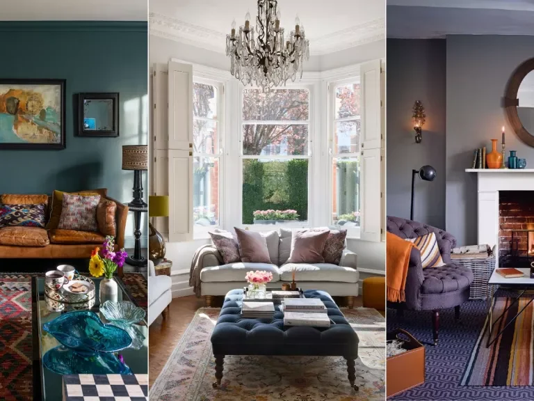
How to whole-house color scheme – for a cohesive look
Some people may find it challenging to choose a colour scheme for a single room, let alone a whole house. Ward & Co., a design firm based in London that welcomes a challenge, is well-versed in the subtle art of colour scheming and knows how to carry a colour across a home by manipulating its tone and depth to create rooms that are uniquely suited to each client.
In theory, using the colour wheel to create a harmonious scheme for a single room should be easy, but how does one tackle a colour scheme consistent from room to room in an entire house?
As daunting as this may sound before beginning a project, meticulous colour design can offer a home a lovely sense of connectivity and flow if done properly. Choosing the right colours and tones for your home can be an excellent decorating tool and a fantastic way to inject your unique style throughout the space. Whether bold or muted, colour can dramatically affect a space.
EXPERT WAYS TO A WHOLE-HOUSE COLOR SCHEME
Here, Rosie, Ward & Co.’s Creative Director, presents seven of her top tips for making a significant design statement using colour as the focal point of your home, exemplifying why designers utilize whole-house colour schemes so effectively.
1. CHOOSE A WHOLE-HOUSE COLOR SCHEME BASED ON MOOD
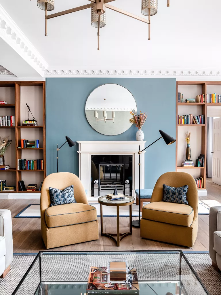
Selecting an overall colour scheme for a property is a time-consuming and involved process that is affected by a wide range of variables, such as the owner’s location and way of life.
The location of the property, the neighbourhood, and the circumstances surrounding the house are all factors to consider when settling on an overall colour scheme for the home.
We must have in-depth discussions with each client to fully grasp their individuality, way of life, and intended aesthetic for their home.
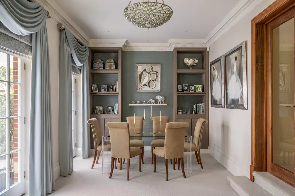
The beautiful blue colour scheme used throughout a recently completed apartment in London’s Covent Garden was thought to be quintessentially British and a fitting complement to the residence’s impeccable craftsmanship. The tranquil colour scheme made for a great place to relax, apart from the hustle and bustle of the streets below.
2. USE ONE COLOR TO CREATE CONNECTION AND FLOW BETWEEN SPACES
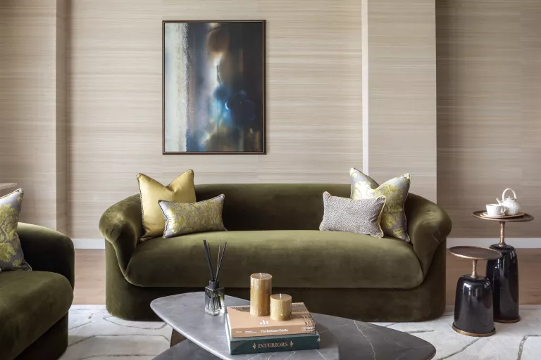
Understanding how different colours interact is essential when deciding on a colour scheme. It ought to be smooth and aesthetically pleasing.
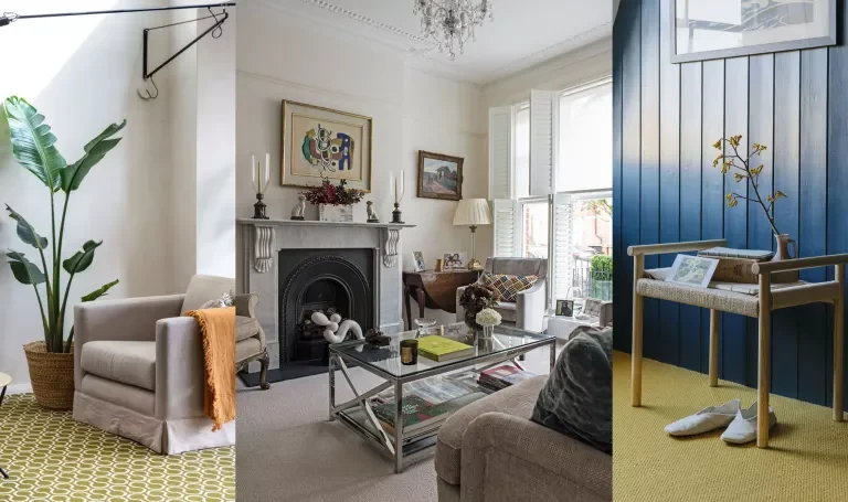
Using gradations of the same colour is suggested to establish harmony and cohesion among various areas. It’s crucial to keep things flowing smoothly, so try utilizing complementary hues in transitional rooms or tones from the same colour family to create a harmonious colour progression.
When a home is viewed as a whole rather than a series of separate rooms, the transitions between them are seamless.
3. WORK WITH NATURAL LIGHTING
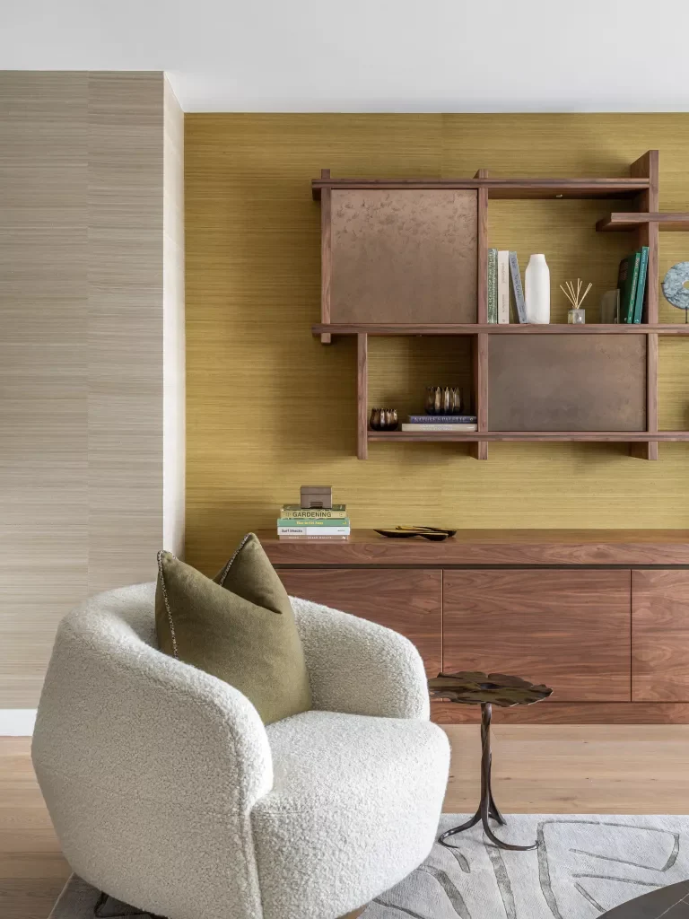
Considering the amount of natural light entering the room and how it affects colour perception is a crucial external consideration when choosing a colour scheme.
It’s essential to consider the role that light plays in the scenario, both in terms of the amount of natural light that enters the room and its intended function. Light from the north is bluish and chilly, while light from the south will make dark colours pop.
The beauty of whole-house colour schemes is that they can be modified for the varying amounts of natural light in each room. Don’t let the light in a room discourage you from using bold colour combinations. The lighting in each room may be changed to accommodate the amount of natural light and the time of day it is typically used.
4. INTRODUCE POPS OF COLOR WITH ACCESSORIES TO NEUTRAL SCHEMES
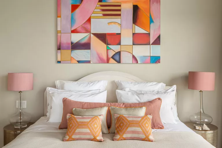
More individuals are on board with daring designs, textural texture, and vibrant colours because they spend more time at home.
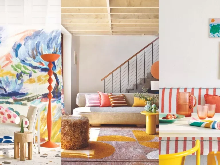
Pops of colour are a terrific way to infuse fun into a design, even if you’re not a fan of bright colours. Cushions, lamp shades, and other decorative items can add pops of colour to a living room decorated in muted tones. Besides giving a room a new lease on life, this is also simple to alter if you decide you want to try out a different colour scheme in the future.
Combining this with a sense of humour about texture can make even the tiniest room feel like a party. Adding a chunky jute rug, for instance, can give texture and depth and balance the space, pulling your eye to the colour without necessarily needing to match the scheme.
5. ADD MODERN ELEMENTS TO HISTORIC BUILDINGS
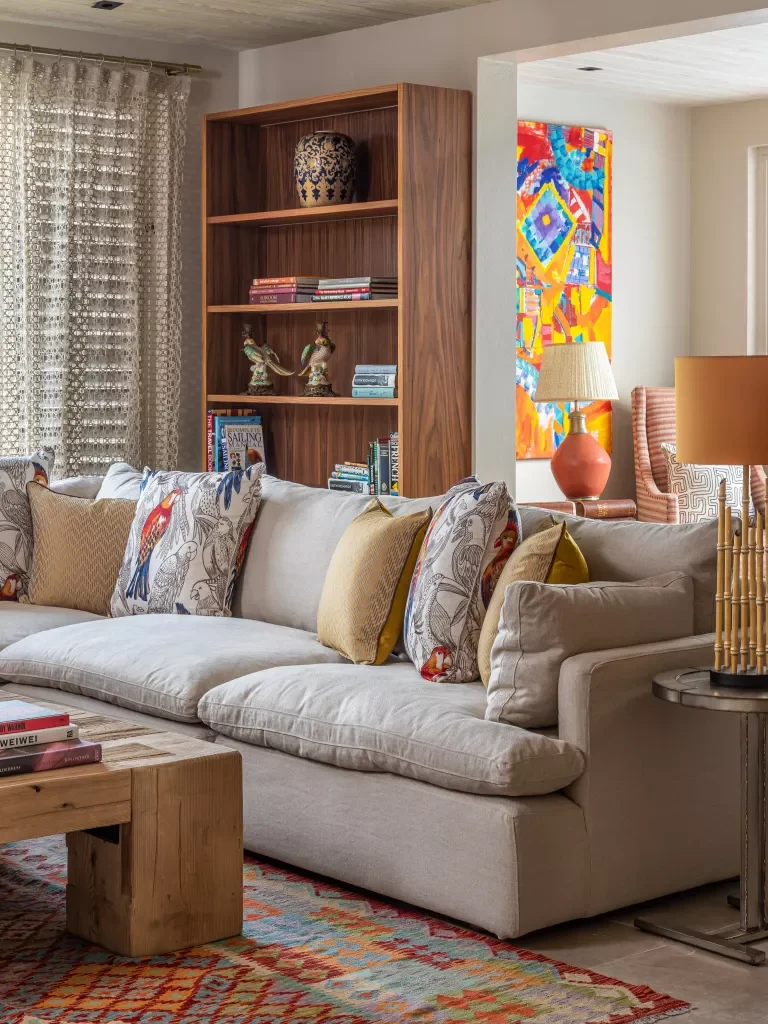
We may use colour drenching in both new and old buildings, which is one of its many advantages.
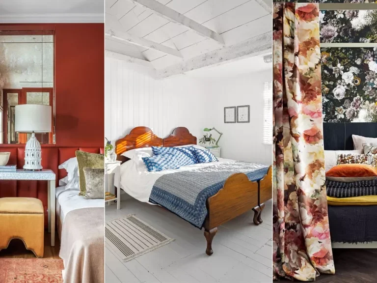
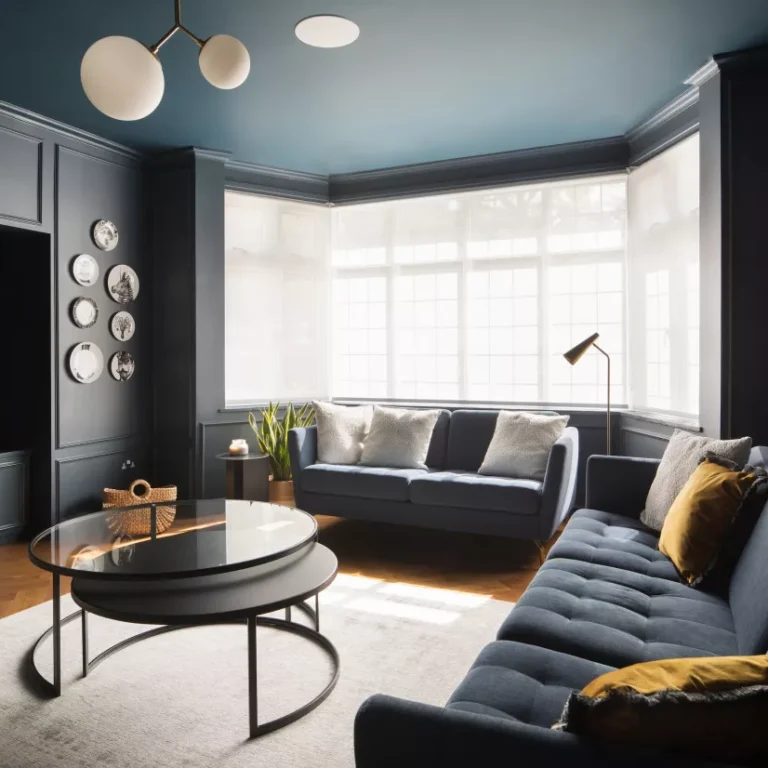
Colour saturation is better suited to older homes, in my opinion, because it helps to set out the architectural details like cornices and skirting boards. It’s a clever trick to give a room with classic elements a more modern air.
Contrasting a pale ceiling with somewhat darker woodwork can look stunning. A conventional parquet floor with a strikingly patterned rug is a superb example of pattern and colour saturation pairing.
6. CHOOSE THE ROOM YOU FREQUENT THE MOST AS YOUR STARTING POINT
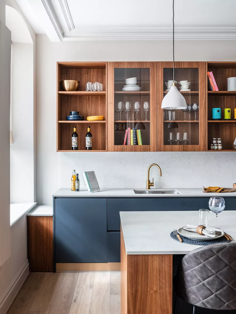
Your home’s colour scheme should be based on your most used room. This is typically the kitchen or the primary living room.
As indicated before, we featured a daring use of colour soaking in the kitchen of the Covent Garden Piazza project, which is the ideal place to play with colour. We went for a modern yet functional appearance by pairing stone-topped cabinetry with satin gold faucets, decidedly warm tones, and padded faux-leather bar stools.
7. ARRANGE COLORS INTO SPECTRUMS OR SEASONS
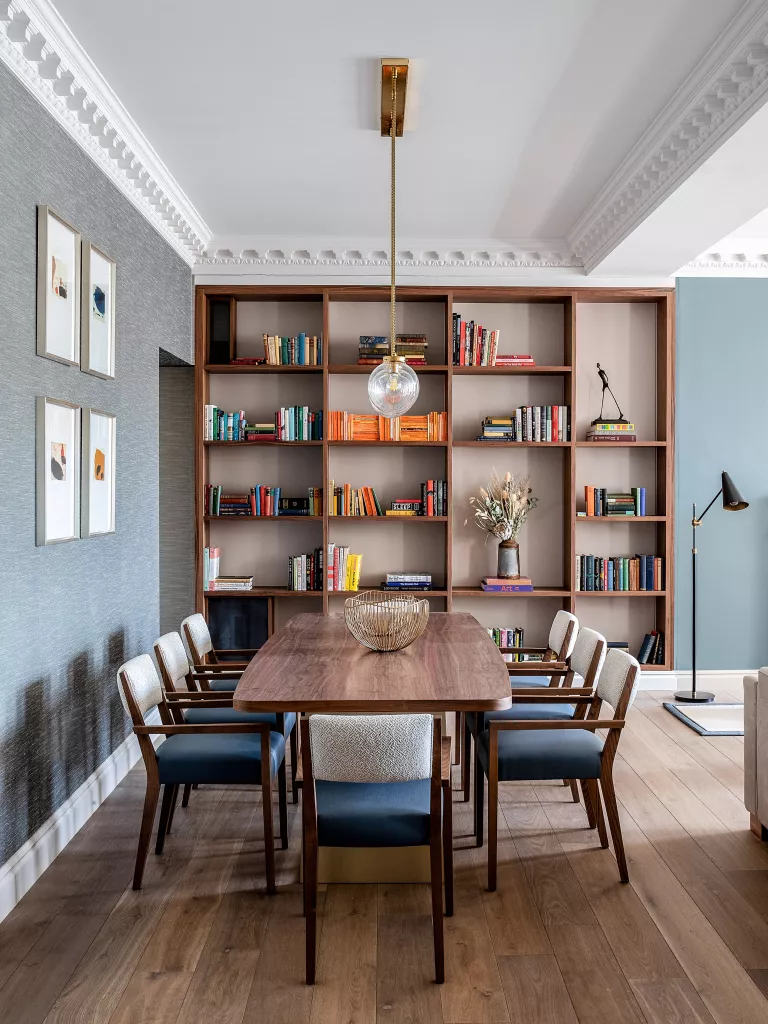
A spectrum strategy must be incorporated to guarantee that each room is consistent without losing its identity.
When the rooms in a home are well-coordinated, it’s reassuring on many levels and makes for a more relaxing room, especially if square footage is at a premium.
To accomplish this, colours should be grouped into spectrums or seasons; for example, in the winter and spring, you could use cooler tones like blues, greys, violets, and various shades of white; in the summer and fall, you could use warmer tones like yellows, oranges, and browns (I’m really into olive green right now).
IS IT OKAY TO PAINT A WHOLE HOUSE ONE COLOR?
It is OK to paint an entire home the same colour, but this works best if the base colour is neutral (white, cream, pale beige, or light grey) and accent colours are put on top or if you use varying tones and shades of the same colour in different rooms to meet the needs of each room.

